So my first project for TMP II is done. It's pretty much a class on graphic design, which I never really had any experience with before, but I rather enjoy.
We had 4 different studies for this project, all dealing with arrangement of 10 rectangles and or squares. We're learning about the illusion of space, texture, composition and balance, proximity, and unity. Also big was the dynamics of figure and ground.
Study 1 was all black blocks and study 2 was blue, red, black, yellow, or white blocks. Study 3 was blocks of text (newspaper or the like) and study 4 was blocks from pictures. A few posts down I put up my first thing I did in this class, it was my first iteration of study 1. I like my new one better. They're all below.
Study 1 Black Blocks

I designed this to look like the equalizer in iTunes (the bars that jump up and down correlating to your music that is currently playing, don't know if I've got the right name for it).
Study 2 Color Blocks

This was designed to be symmetrical down the diagonal while giving the illusion that the horizontal center of the picture plane is further away than the top and bottom edges. I did this by fading the colors closer the middle on the bottom set of bars and sharpening the colors going away from the middle on the top set of bars. And of course, closer to the center of the picture, the bars are shorter.
Study 3 Text

This was a surprisingly fun study to do. I had a great time searching for things like old newspaper clippings on Google and messing with their colors and saturations. I tried to make it look like the top of the picture plane was further away from the bottom by arranging smaller blocks on top and lighter colors to contrast the heavy, thick blocks on the bottom pulling the arrangement down to the base.
Study 4 Photo Blocks

So in the 4th study, I was trying to use several different pictures cropped out of loosely related photos. I had this one of Audrey Hepburn that I was using, it dawned on me to cut that one up into the 10 squares. I arranged them so. I really like this one. It's my favorite of the 4, and not just because I like Audrey Hepburn. How it is still one congruous photo because of the organization of the blocks, but each column dosen't give all the info needed to discern what is going on is really pleasing to my brain.
---------------------------------------------------------------------------------------------
You know I once read that most blogs have one reader. Thanks Mom. Knew I could count on you.
Anyway, thanks for reading (Mom). Please feel free to leave comments.

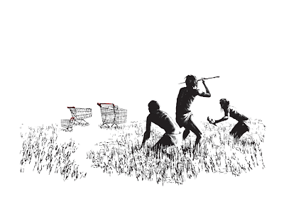
 So at Mars Hill (church) this weekend, the pastor Rob Bell, who is the coolest, hipest pastor you'll likely meet (and not in that "Hey I'm like you kids! I like your music and have boy/girl problems to! Hey! Meet my buddy Jesus!" That's just lame.) Ok back on track here, he talked about the British graffiti artist Banksy. All the pictures in this post are of Banksy works.
 I had heard the name before in class, but had never seen some of his work before. Rob showed us some of it, wow, really some really great stuff, some provocative some just funny. Talk about graphic design inspiration! I highly recommend you check out his site and some of his work, my favorite stuff is under the outside tab. Just click his name up there.


