Monday, December 15, 2008

Branded Puzzle. Finished?

The mock marketing poster for the Big Boy Brands Puzzle.

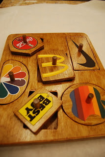
The Brand Puzzle for my CFC II final project was finished last week. I'm pretty happy with it. I'd like to redo it and use the CNC router instead of a hand held jig saw to make it, it would look more professional then. Also, paint the logos or at least cut the paper out better and cover them with a clear epoxy.

Either way, here it is. Artist statement first. You can see the mock marketing poster above.

My First Puzzle™
Big Boy Brands Edition
Baby puzzle created with the images of American business icons
to teach toddlers the correct brands early in life to
ensure social acceptance in adulthood.


The Big Boy Brands puzzle is a reaction to the American obsession with brands. We start kids young on brands as image and culture. Gerber, Toys R’ Us, Mattel, Fisher Price, Barbie, Lego.

As we get older, our obsession with brands only grows as we move to more grown up types of brands. Nike, Apple, Coca-Cola for example. The Big Boy Brands puzzle is a reaction to the move to grown up brands from the icons of our youth.

I designed the Big Boy Brands puzzle by My First Puzzle TM with the idea of the marketing campaign behind the piece appealing to overly concerned parents. The ad campaign poster reads “Parents! Help your toddler grow up right with the Big Boy Brands puzzle from My First PuzzleTM,” and “practically ensures social acceptance in your child’s future!” No parent would not want his or her child to fit in, and the Big Boy Brands puzzle imprints popular brands and images of the older demographic on child minds, only guaranteeing the child would dress and act similarly to the rest of the majority; fitting in as a shell only. Our obsession with brands and their images creates our popular culture and dictates its course. All the Big Boy Brands puzzle does is make sure your child grows up on the same course as countless other children.
-Pete Hall

Materials:
• Birch Plywood
• ½” Dowel Rod
• Print materials (paper, ink) for logos and advertising
• Puritan Pine Wood Stain
• Wood Glue
• Super 77 Glue

Resources:
www.walmart.com/catalog
brands.babycatalog.com
news.cnet.com
• Shopping, A Century of Art and Consumer Culture. Ed. Gruenberg and Hollein. Hatje Cantz Publishers, London. 2002.
• U of M Wood Shop and Fabrication Studio Tools



Thanks for reading!

Winter' 09

Originally I was supposed to be raking in the dough as a mechanical engineer one semester removed from U of M. Then I switched to industrial design. And added 3 years of school. Thank God. I am so much happier now. I would have made a crappy engineer anyway!

So, it's winter break. 3 weeks to decompress. I needed it. Grades are starting to roll in, doing well so far. Two A's and one C (I hate you CFC. Die already!).

Looking forward to next semester, I've got some interesting classes.

- 300.1 Dimensional Languages: A Study of Form & Language TTh 8:30-11:30am 2147
Andersen, Jan-Henrik
The focus of this course is on understanding how dimensions of form languages communicate and structure meaning and function of designed objects in rapidly changing socio-cultural systems. Instruction will cover design semiotics and semantics and experimental exercises in three-dimensional design with a keen eye on form and color literacy. The course will provide students with portfolio quality projects with emphasis on design processes and experimental form development including rapid prototyping technologies.
Prerequisite: Experience with 3-D modeling, visual communication, and manual fabrication.

- 300.29 Sketching Ideas MW 6:30-9:30pm 2058
Lee, Chiwei
This course focuses on generating ideas, ways of augmenting the interest and complexity of those ideas, and building a structure to house and let ideas live. The course encourages sharing thoughts about the creative processes of working, and about using multiple media for particular expressive aims. Students gain experience in ways of working out and presenting ideas, in the near-term, for your senior projects, and in the long term in your professional life. Students develop and sketch out a comprehensive creative project, realizing at least part of it, so as to be able to present an idea in a convincing way, much as one needs to when applying for a grant, an
exhibition, a performance, or proposing a senior project.

- 231 Concept Form and Context III
Ahmadi, Shiva
One of a sereies of three required freshman/sophomore studio courses that focuses on problem identification, problem investigation and refrenceing, and subsequent development of creative reponses. Each exercise and project incorporates reading, reasearch and writing components. By integration of critical thinking and language skills, the students are challenged to develop personal expressins through both analytical and intuitive approaces. The course focuses on structrued projects that encourage the development of transferable perceptive and formal skills in a world-view conceptual response.
(I hate these classes, this is the last one I have to take.)

- 300.40 Desinger Bootcamp
Jackson, Shawn

Couldn't find an official description of this course anywhere and I must have deleted the email with the info in it. Anyway, it's all about product design. I am beyond excited. Shawn Jackson is supposed to be Mr. Product Design. Check out his A&D faculty page from the link on his name. He's even got his own design firm. Bitchen.

Oh and the Penny Stamps Thursday Night Lecture series that all A&D students have to go to of course. This can be really interesting, like when Theo Jansen came and talked to us. That was amazing. They even got Michael Moore this year (his talk actually was boring and rambling, I've seen him talk before, he should stick with movies, he can edit his rambling then into a cohesive idea). But sometimes...we had the major of Bogota, Columbia. He taught us how to hold down street gangs and sounded and looked like a serious Borat. No idea why he talked to the art school.

What classes are all you Michigan A&D kids taking? Or any art kids who might read this?

Thanks for reading!

Monday, December 8, 2008

No laser cutter even? Wow.

I had mentioned a month or so back that I was looking into the Columbus College of Art & Design (CCAD) as an option to transfer to from Michigan. I was unhappy but more than anything just unsure about the quality of the education I was receiving in industrial design. Chiefly I was concerned about the perceived lack of product design experience and basic design skills at Michigan because of the openness of the A&D curriculum (after our core courses, there are a whole selection of advanced studios we can take, some offered regularly, some not).

This was until I got a closer look at the advanced studios pertaining to I.D. and had talked closer with professors. But just to be safe, and make sure I was making the correct choice, I visited CCAD, which was my top alternative to Michigan. They have a pretty well known ID group, but after visiting today, I have no clue why.

I was unimpressed with the facilities for industrial design for one, paltry and small at best. Also, after coming from a school like Michigan, where things can be hectic and unorganized, this school was a bit off (it was a college day type event, I was impressed by how poor everything was set up, tours before information sessions, not showing you any work spaces in the tour only showing you what some students have done). I was able to talk with the head of the industrial design department there for a bit and came away underwhelmed about the school. It seemed that while there was definitely a course structure set up for you, it seemed very rigid, with little opportunity to try different techniques. Also, being a small private art school, they had no possibility of minoring in anything other than art history or fine arts. I'm interested in a psych minor focusing on how people interact with objects to complement my B.F.A in industrial design I'm getting and my 3 year concentration on mechanical engineering. That's out the window at CCAD.

Oh and the kicker, here I am worried that Michigan won't be able to teach me the technical skills of design and model making and CCAD doesn't even have a freaking laser cutter, M has two. Or vacuum former, M has 2, one large one smaller. Or 3-d mill, M has 2 I think. Or rapid prototyping, M has one. I was amazed. How can you make really intricate designs look really really professionally cutting all by hand? Those CCAD ID grads must be wizards with a good ol' exacto knife!

Plus I'd lose a year in transferring schools, so it would take me 8 years to graduate. Nope, now way at all.

So yeah, I'm staying put at Michigan. If looking at other schools has shown me anything about M A&D, it's that we have some pretty cool technologies available to us and to be thankful for all the extra interesting opportunities that Michigan gives you.
Oh and I love Michigan football so that's a big plus. Columbus is kinda a sucky city anyway. Ann Arbor rules.

Thanks for reading! Go Blue!

Friday, December 5, 2008

Branded Baby Puzzle

I worked long and hard last night on the start of the brand baby puzzle. It was great to work with wood, I enjoy like it.


The board is fabricated from two separate pieces of wood. The base is solid and glued on top is the piece with the holes for the brand pieces.


I still have to sand the board down nice and smooth to varnish it. I've picked out a nice walnut stain for it. Should be really nice.

Thanks for reading!

Thursday, December 4, 2008

My website!

umich.edu/~petemh

Check it out! I've got my website up. It's my digital portfolio and home base on the web. I've uploaded most of my old work (the good stuff anyway!) and will keep uploading recent work. I'm also working on adding a selected works tab to highlight work I'm particularly proud of which will include descriptions of the project, my process of design, and project reflections. Pretty much, it will be like my blog posts, but polished.

Thanks for reading!

Balloon Harp Realized

The balloon harp came together nicely this week. I'm really quite happy with it.


The harp was designed for looks instead of quality of sound. It still makes noise, but how good can stretched balloons sound? Kind of a buzzing sound, not horrible, it's interesting actually.
I love how the neon colors of the balloons look against the rich stain of the wood. The balloon tops along the top of the harp are beautiful, almost like a dinosaurs back spikes. Almost.

For more pictures, check out my website/digital portfolio that I just put up. umich.edu/~petemh
I need to update the site with more recent work but you can see my robot and the balloon harp, as well as some old work. The harp is under industrial design.

Thanks for reading!

Culture for Babies

I've changed my idea for my final culture project for CFC II, we've had 1.5 months to work on it, and I change my idea 5 days before it's due. I was never really to happy with my old project idea, the Norman Rockwell print appropriation one, and having wanted to work with iconic brands at first but never figuring out a good way to do that, I had stuck with Rockwell.

Well, it hit me like ton of ACME bricks yesterday (I'm ok since nothing made by ACME really does any damage). I was interested in the creation of brand cultures and how they get started, and in thinking about not getting to see my little cousins at Christmas this year, I thought of how we start kids young on brands. Gerber, Toys R' Us, Mattel, Barbie. Giving them a subconscious idea of what is good in the market, and what is good thus for them. My grand inspiration was simple puzzles for babies and todlers. The ones with trucks and dogs on them.

Baby Puzzle

I've decided to do this with iconic "grown up" brands. That's iconic in the sense of most Americans would recognize the logo quickly. I made a list of iconic brands.


Nike

McDonalds
NBC
Coca-Cola

Best Buy

Apple

I'm using their logos as puzzle pieces. Does anyone else find it funny that I labeled these 'iconic' brands? Do they really need labels?


Screen Shot of Logo Layout

Shouldn't be to terribly tough to make, wood, jigsaw, sandpaper and woodglue for the pieces and maybe screen printing for the logos. Course, I've said that before. Could be tough. Especially since I have a exam on Monday and won't be around this weekend to work on it. hmmm. Wish me luck!

Thanks for reading!

Tuesday, December 2, 2008

The Angelic Sound of the Balloon Harp?

For TMP III we are working with our hands now, which is a nice change. I've really quite enjoyed the video, audio and website work this semester, but I love making things with my hands.

We are creating musical instruments of sorts. Some people are remaking real instruments out of materials not normally used for musical instruments, while others are making up entirely new instruments.

I fall under the remake with new materials category. I'm making a harp, using stretched balloons for the strings. It's going to be pretty sweet, I've prepared the frame, made out of varnished wood and I'm stringing/ballooning it today. It's not going to be a real instrument, not even close, but it should be cool!


I'm also working on a final piece for my CFC II culture class, it's going to appropriate a Norman Rockwell print from the Saturday Evening Post covers. I'm dealing with idolization of the American way and contentment versus desire. Should be interesting.


Thanks for reading!

Sunday, November 23, 2008

Reasearch Paper...

There is little I dislike more than writing research papers. I am researching for one currently. Something or another on race and civil rights relating three different pieces.

I really don't like papers.

Friday, November 21, 2008

Michelen Man Sculpture

So over the course of the second half of my semester I've been working on a sculpture in one of the classes I'm taking that I rarely mention here. TMP I Construction (the other being the super boring, waste of time A(rt)D(esign)P(erspectives) I The Creators). I've not oft mentioned it because while I really enjoy working with my hands, I've found sculpture not to be my favorite hands on activity. Especially when we've been working with clay and plaster the entire semester (o.k. a tiny bit of cardboard was in there too).

The sections are also supposed to have a wood project. Other sections of the course have made some really cool bench's that I was really jealous they got to do. My prof likes clay, allot. So we've done it, allot. I hate how dry it makes my hands, takes a solid day of moisturizer to get them not feeling like cotton balls. But that is besides the point.

I've made the Michelin Tire Man! I decided to do him because then I wouldn't have to do muscles or clothing! It took while to make him, but it was ultimately not that hard, just time consuming (like everything else in art school). He's pretty cool.


Our next step is to ruin the clay model. We're casting them out of plaster, by covering them in plaster. Not sure how that is going to work, but OK.

First we've added our shim walls made from aluminum (Arizona Juice) cans. These give us section splits to take the plaster molds off in.
I did the Michelin Mans head first and it looked like he had a halo.


Next we covered the suckers in plaster. Something was wrong with one of the layers of plaster I put on the top half of his back. Not good. Not good at all. I've made it work through extensive patching with more good plaster over it to give it strength, but oh boy do I handle it gingerly. I've got that section off here and was working on the bottom half of his backside. All the coils I used for his tires came off with the mold.


The bottom half removed. All the coils were cut by the aluminum shim walls so it's interesting to see the core of his leg surrounded like that.


The mold for the lower section of his back, i.e. legs and the base.


It was actually quite fun to pull that stupid clay Michelin Man apart. I spent so much time on him, it was like sweet revenge.
As you can see, he had a foam and wire armature that we put clay over for initial forming, which of course, stay in. Until this of course.


The front half of the mold was one large piece as we didn't have to worry about the armature pipe. This is pretty cool looking I think, but I may just know how many stinking hours it took me to get here!

Tomorrow we do the casting part. We'll see.


Thanks for reading!

Monday, November 10, 2008

Global Awareness

We had a quick project for CFC II Culture recently, dealing with the global culture and exchange.

I had heard about forced child labor in Africa and parts of Asia in the textiles and food products, and after some research through Stop The Traffik, I found out about the worlds chocolates origins. Chiefly, the worlds chocolate comes from West Africa, 80 % from the area, and 46% from the Ivory Coast alone. West Africa has a history of forced child labor, especially when cocoa prices drop and manufactures try to cut costs.

I wanted to specifically highlight this fact and cause people to question, and actually think, about where their chocolate comes from.

I used the iconic Dove Chocolate foil wrappers, the ones with messages on them like "Treat Yourself Today" or something pseudo-philosophical. My messages read "80% of the worlds chocolate comes from West Africa." "A region with a history of forced child labor." "Who made your chocolate?"

I used photoshop and simply reworked images of the wrappers I had taken. Pretty easy really, clone stamp tool to clear up the wrappers initial messages, and simple matching of font and color to insert my own images.

I'm really quite happy with the finished piece.

Thanks for reading!

Tuesday, November 4, 2008

Mapping What Is Already Mapped

Our latest project for digital studio was a map, well no not really it's not the latest, we did it a few weeks ago, I'm just behind the ball on updating! (I'm trying to get better, really)

We all had to map greater Ann Arbor and get a few specific roads (the main ones pretty much), University Campuses, the Botanical Gardens, the Huron River and such. I came into this project pretty skeptical, I mean, 20 students all mapping the same area? I assumed we were all going to have similar projects. I was wrong. Of course, we all mapped the same areas, but all had very different ways of going about it. Glad I was wrong, the end results were very interesting and varied.


Ann Arbor Map (click map for full view)

London Underground Map
I decided to base mine on the London Underground subway system maps. For all the information that they convey, they are deceptively simple, and iconic because of it. I really liked how all they used is color and circles to convey where the tubes go.
I decided to borrow/rip off this idea for my Ann Arbor map. At the beginning and end of every road is a colored circle. Each road has it's own color so you can follow it from it's start to end easily with your eyes. The highways surrounding Ann Arbor (M-14, US- 23, I-94) are thicker lines and bolder, two tone roads to give hierarchical importance. The key clearly explains what the colored areas represent along with the text over the specific areas to specify say, which garden is which.The compass is incorporated into the red and blue Underground logo, which now says Ann Arbor of course.

My map is obviously not intended as a replacement for an actual map of Ann Arbor, mine is way to simple and stylized as a graphic to work in that capacity.

I'm pretty happy with the end result, although it could use a bit of reworking layout wise to incorporate the logo and key overall. They seem to float a bit. Otherwise, I'm very happy with my map.

Thanks for reading, I'll keep posting!

Sunday, November 2, 2008

Video Pieces

Roughly one month ago I said I was going to update that weekend. That weekend is happening now, it will be glorious.

I've done some work with video this semester for my TMP III (time based media) class. We're using Final Cut and started super simple. Text and still images. We had to tell a story (that's kinda another part of the class, story telling using these mediums).

This was my first video, The Story of The Film (So Far), using text and found images.
It moves quickly to heighten the sense of pointlessness of a mid film summing up. It's also an homage to Monty Python's Flying Circus. I also realized I had previously posted about this movie, but it's nice to have all my video work in one post for easy viewing.


My second video is a stop motion type. I took lots of images of myself and sequenced them together (it's like a video flip book, or stop motion if you want to get all technical). It's called Pocketed Words. I made it for my fiancee, Kara Mia.


The third video I've done this year is actually a video, like the real movin' pictures like in Hollywood! It's an expansion on the ideas I explored in Pocketed Words. My professor (Tirtza Even) encouraged me to explore where on my body I took the words from and play around with the deeper meaning of of "i love you". I'll explain a bit after the jump/video (I only wanted to use the term 'after the jump' because I see it all the time on websites now and I wanted to be in vouge too!) This is called, Close To The Vest. Again, for Kara Mia.


I explored the meaning of my pockets and where on my body they were in this by the level of the pockets on my clothing and proximity to my skin. So 'i' started out on my jacket pocket above my left side (above my heart, on purpose), 'love' was one layer down in my vest and 'you' was in my shirt pocket. So as I went deeper into the intensely personal phrase of 'i love you', I literally was moving closer to my heart and bearing it. Tirtza loved it. Kara did too!

I've got lots of digital work and some ceramics work to show you as well in the near future. My current week should be significantly less crazy than the past few! Thanks for reading!

P.S. I'm making a longboard (a long skateboard made for cruising, not tricks) with the U of M chapter of the Industrial Design Society of America. Learning, finally (not thanks to U of M A&D, more on my dissasifaction with my education quality later), to use the laser cutter! Sweetness. But no seriously, this place (U of M Art & Design) has no focus, with no majors everyone is just kind of floating around aimlessly. I'm frustrated and thinking of transfering, see the Chchchanges post before this one.

Thursday, October 9, 2008

A few seconds...

I've been rather busy. 4 studio classes will do that to you. I've got allot to post about, as when your super busy, you end up with lots of work.

This weekend. It's coming.

Thanks for reading!

Tuesday, September 16, 2008

The Camouflage Is Concealing All My Problems

As I vaguely posted previously, our latest project for CFC II is on camouflage.
Part of the assignment description:
"...the issue of visibility and invisibility lies at the core of any discussion surrounding camouflage. Understanding camouflage as a process of concealment and acculturation, you are asked to think deeply about these issues on a physical as well as a psychological, social, or cultural level.
You are then charged to put your ideas into practice by creating an artistic response to this topic."

So I was thinking about camouflaging or changing the normal function of an everyday item to do something extra-ordinary or a task not at all associated with that everyday item. I settled on working with kitchen appliances, specifically a blender, because of the interesting connotations that kitchen appliances have. They are a decidedly normal item, we all have microwaves, toasters, blenders, coffee machines populating our counter space but they are more and more associated with chic design. A browsing of Target.com's blender selection shows no less than 5 blenders, adorned with stainless steel and colored plastic, all color coded to go with your kitchen motif. I picked the blender as my everyday item because the smooth lines and singular design motifs common to each one (they all look pretty much the same in form).

To change the blender I mind mapped the various functions it performs and decided to work with liquids as they are always involved in the function of a blender, be it going in to be blended or the product of the blending. I settled on using wine because of it's antithetical qualities to the blender. Where a blender is a normal everyday, middle class item, wine is seen more as high culture and ritzy. A blender often is stored away in a cupboard while a wine collection is proudly displayed.

My Notes on "Why?"

In my debate on how to change the blender in respect to the wine I decided to serve wine as it is not normally served. For the non-wine drinkers, depending on the wine you are drinking, it is either opened hours before drinking and possibly decanted (poured into a specific vase to give it more surface area) to let the wine breath or drank immediately after opened. It is always poured from the decanter or bottle to the glass. Wine is never 'on tap'. So I decided to do exactly this.

In doing this, I was changing the function of the blender (from blending to distributing liquid) and concealing this change so it still looked like a blender from the outside. Also, I'm going to create a reservoir for the wine in the blender pitcher and cover it with grapes. Grapes become wine by being squished and fermented, so it kind of makes sense that they are in a blender (work with me here a bit). Also it conceals/camouflages that there is wine in the pitcher, which would be a giveaway that something was up with that blender.

Rough Preliminary Idea Sketch

Now after all of this, you would think I would have already made my wonderful blender wine tap. Nope. I'm waiting for my hose and faucet (purchased from a home beer brewing store) and am still trying to get the blender I purchased at Ann Arbor's Recycle Center opened to gut the mechanical internals so I can run my line out the back of the blender's base. The base is bolted on with these little 2.5mm allen (hex) bolts which have this tiny little pillar in the middle of them which don't allow a normal solid 2.5 mm allen key to fit in a unscrew them, which means I'm screwed (pun intended). Now I've got to make a hardware store trip to get some hollow allen keys and drop some more cash from my limited supply to get into the dang thing. It's going to feel great to finally break it open!

This evening, my thoughts are pretty organized on why a blender and why wine, but this morning, oh boy...we had a mini-critique halfway through the assignment. I was not prepared on the context of the project (CFC stands for Concept, Form, and Context), I had spent all my time planing how to make my blender into a wine tap and it showed. They ate me alive. A classmate asked, "How does it address culture (as it is a culture class as well) and context?" I looked blankly at her and made a conscious decision to not B.S. on this and said "Hmmm, don't know." It was a slippery slope from there. Needless to say, I did some thinking this afternoon, and with the assistance of my fiancee, Kara, got to where I am now.

Once I actually start making this piece I'll post pictures, in the meantime, thanks for reading!

Thursday, September 11, 2008

Give me some wine so I may say something witty!

One (1) "Party" Faucet


Plus

One (1) Blender

Plus

One (1) Bag of Wine


Equals

Camouflage For The Kitchen

(details and pictures to follow soon)

Wednesday, September 10, 2008

Time is tick tockin' away

So, the semesters started up!

Let the great experiment begin!

I've got lots of things coming down the pipe right now (including, hopefully, something having to do with wine!), and not enough time currently to blog about all of it. So I thought I'd post something new for me, a video.

It's for my TMP (themes, materials, and processes) III class, which is a time based media studio. Everything from movies to flipbooks. I've posted our introductory assignment which is just to familiarize us with Final Cut (they actually gave it to us!). It's under one minute and uses only still shots to create a story. I made mine on made up relations between people in different stills. It's also a homage to Monty Python, so what's not to like? Nothing.
Oh and we had 2 hours to make it. Trial by fire here at U of M A&D.


The music is "Shark Attack Theme" from the soundtrack to The Life Aquatic.

Thanks for reading, I'll be updating this blog much more regularly now that the semester has started back up.

Monday, August 25, 2008

ID Website

John Marshall recently turned me on to this industrial design website, Core77. I love it and just spent 2 hours looking at it. Best use of time ever.

I'm really looking forward to starting classes and getting working!

Thanks for reading!

Friday, July 18, 2008

It's Only Rock and Roll (But I Like It)

So, a rare summer update!

I had previously posted about an opportunity to design guitars for a new company that one of my co-workers at Terra Trike, Ben, is starting up. The owners of Terra Trike also have this super small side start up guitar company called Etavonni. Ben is the lead guitar tech for them, but naturally wants to have full control of his own ideas and is starting up his own guitar company, Lumen, to take full advantage of his contacts in the guitar industry. The thing with Etavonni is that they cost $7,000, way out of most peoples price range. Ben wants to make a sweet looking, nice sounding, guitars that garage bands can afford.

Well when you need a guitar body designed, who's your favorite art student baby!

Ben came to me with the head stock picked out and a general idea that he wanted to make it swoopy and kickin. I just got to go to town on the design and have some fun. After a few sketches, this is what Ben settled on as what he wanted.


Yep, my design. Pretty cool huh? Ben has a guy in North Carolina making the body for him, this is the first prototype.

The other super cool thing about the look is not just the body design but where the guitars name sake is coming from. Ben found these super thin sheets of lights (not LCD exactly) which we are working on affixing to the front of the guitar. The sheets light up in a certain color and can do two tones. I'm working on some graphics for the front in lights, I'm a bit limited in size restrictions as the larger the design the more expensive it gets. If this really takes off, we'll look into some of my more intricate, larger designs.

Currently the graphics are just in the sketch form. Keep in mind these are going to be in lights, like say neon green on a gloss black painted guitar. Super cool for your weekend gig!


Thanks for looking, I'll keep you all abreast of happenings with Lumen over the coming year.
Related Posts with Thumbnails