Thursday, March 25, 2010

Art Deco Desk Clocks

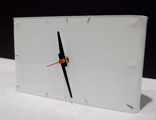
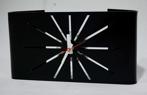
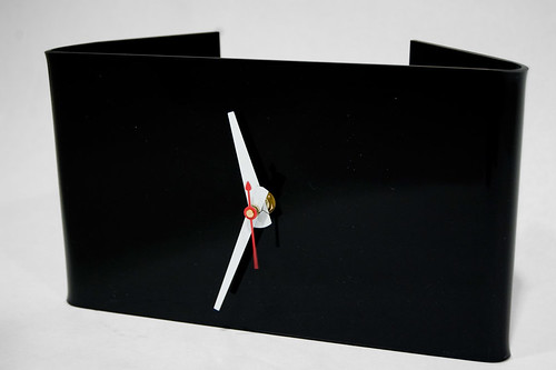
In Architecture of Objects I just finished up with a quick clock project. I really enjoyed the project, quick but the clock is such a classic design brief. I had sketched for a few days and because of time constraints started to build my original design the day before it was due. Of course, in making physical models, all the issues come out and I scrapped the idea at about 6pm and started sketching again.

My inspiration for this clock was actually from the video game, BioShock. I had recently being playing the game and was inspired by the immersive art deco environment and decided to pursue a simple clock which would try to bring the styling of the 1920's into modern materials.
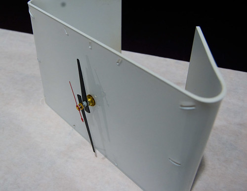
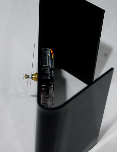
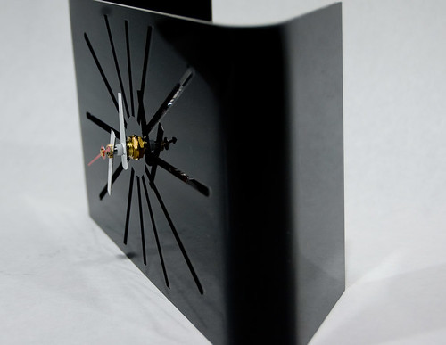
I decided on using clear acrylic which would be laser cut, painted and then heat bent into shape. It was quick, easy and repeatable, which was good since the clocks were due the next morning.

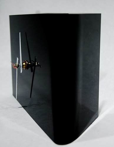
I have three designs in three colors (gloss white, gloss black and matte black).


My favorite of the three is the white clock with the hour markers on the perimeter of the face. Currently, I'm experimenting with the same design in black. The sunburst design, while calling up the art deco influence, exposes the mechanics behind the clock. I'm trying different things with the design to make the mechanics less visible including moving the sunburst starting point out and making the cutouts thinner. We'll see.

The clocks went over well in crit, Shaun felt I had succeeded in styling my clocks after the 1920's and art deco and actually said he would like the white design on his mantle. I consider this to be the ultimate compliment.

Again, for this class I am trying to make products that could be mass produced. With a jig to get the bends correct every time this design would be quite easy to produce on large quantities. I've actually been kicking around the idea of making some more of these and selling them on Esty. We'll see what comes out of it.

Thanks for reading.

Thursday, February 18, 2010

Finished Ikabana Vase

Last Thursday we finished up our Ikabana vases and had our crit. I'll get to the crit in a second, first a bit on my vase and how it was made.

The vase is made of Quickrete exterior anchoring concrete wrapped with aluminum. The concrete was cast in a mold made from mdf. The casting was the biggest headache of the process, mainly because of poor molds made by yours truly. I originally also used Rockite instead of Quickrete. I switched because I wanted the waterproofing that exterior concrete that could be used below the water line would afford and the roughness of the Quickrete versus Rockite's smoothness as a contrast to the precision of the aluminum.

Rockite and mold headaches early on.

The Quickrete in the new improved mold which didn't break part on me. I also wised up on the concrete breaking and soldered together a supporting skeleton using welding wire, mini rebar basically.

The Quickrete vase after coming out of the mold, being sanded to fit the aluminum wrap and being sprayed with a polyethylene gloss. The dark sections on the interior of the vase are leftovers from previous molds attempted with cement colors added. I didn't use the colors (I was using a charcoal) because they pushed the curing time of the Quickrete out to 24 hours instead of 1 hour. It was a result of the process and not planned, but the coloration on the concrete was welcome as it gave the vase a weathered look.

The aluminum being water jet cut in the Digital Fab. Lab.

Aluminum wrap, pre bending. It was bent using the brake in the cold metals shop.

And, the final result with flower arrangement in crit.


So, how did the crit go? It was rough. The worse part about rough crits are when you aren't expecting a rough crit before you show your piece.

The biggest issue was that I wanted to contrast the precision and reflectiveness of the aluminum wrap and support structure against the dark roughness and uneven qualities of the concrete. The issue became that when contrasting precision against rough you have to push precision to its most precise and roughness to its most rough. I felt the aluminum was precise enough considering that I unfortunately had to hand bend the lower tabs holding the concrete and that the concrete it self was visibly chipped, porous and rough but this is a grad level course and ultimately my level of precision and roughness was not up to the class standards.

Also, the aluminum more than dominated the vase, especially when filled with flowers. This was actually a very real problem and looking back on the vase now I feel like it was really the root of all the problems with my vase. With more concrete in view the roughness would be stronger and take all of the emphasis off the precision and allow a more well rounded viewing of the vase.

A lesser bone that they had to pick was the gloss on the concrete made it to finished if I wanted to portray roughness. Jeeze, I want it to be rough but not so rough that it would look out of place in a home so I really didn't know what to make of this one. Since only a few people held this opinion I think I'm chalking that one up to personal opinion and architects who are destined to become professors instead of practicing architects.

My flower arrangement was also a problem for my classmates. It was not dramatic and voluminous enough to work with such a strong, grounded (read heavy) vase. I completely agree on this account and I really didn't care about this issue. I have never arranged flowers before and it was incredibly challenging. Shaun Jackson acknowledged that the whole class had issues with arrangement, but I really feel like he was expecting gold from us on the flower front. All I know is, I'll design the vase, someone else can put the flowers in it.

Really the only good thing anyone had to say about my vase was that they liked the way it was presented with the flowers dominating the foreground of the table and not pushed to the background and the flowers being off center in the vase. A few people also mentioned to me later that they felt some people were being to nitpicky in criticizing my choice of gloss and the concrete not being rough enough. This was nice to hear, but frustrating because they had failed to speak up during the crit.

So, how can I make this a better vase? Well, number one would be adding long thing rectangular windows of sorts to the long aluminum dominated sides to bring the dark concrete through. I really feel this would solve allot of the vase's problems. Also, there was one corner where the aluminum was not completely flush against the concrete, this has to be rectified on the next model with more careful assembly of the vase and the aluminum.

One of the biggest issues for me as a designer over all that has come out during this project (and this intensive class in general) is that I need to get better at speaking about my work. I've taken classes dedicated to the language of design so attempting to put my designs into words is not as much an issue for me. The issue lies in vocalizing my designs during the crit itself. I think this really is an issue of pubic speaking, something which I am not particularly afraid of when I have practiced what I am going to say. There in lies the issue, I am not in the habit of preparing what I am going to say before a crit beyond a few words. Therefore I end up stumbling through my ideas and not effectively portraying them. So, practice, practice, practice.

On a fun note, my vase is now on display outside of the Media Union here. It looks pretty good in a little nook Shaun Jackson found for it. Little win!

Thanks for reading.
Tuesday, February 9, 2010

Ikabana Vase Sketch Models

Just a few of the sketch models I've made in deciding what design to pursue for my final piece. The models are made out of foam core and chip board which is laser cut and then either glued or pinned together.

In these models, the foam core represents the reservoir of the vase and will be made out of Rockite and the chipboard represents stainless steel which will be water jet cut and bent into shape around the Rockite.

Iterations of two designs I'm working with.

The first design is a tall reservoir with a stainless piece of steel straddling the Rockite. I wanted to create a strong, grounded receptacle rising out of a light, kinetic form drawing the eye upward to focus on the flowers using the vase as a way to focus the viewer on the natural beauty of the arrangement. The tab of the stainless steel on the top of the vase would act as a divider between the heavier plant material and the more delicate flowers and would reinforce the upward motion of the vase.

This design will be 8" tall, with a 3" x 2" reservoir.

The only difference between these two iterations is that the model on the left has a shorter piece of chipboard which creates a smaller foot at the bottom with a straighter line as it travels up the Rockite.

This is the other of the two designs I've been working on. This is a much more rectangular, low to the ground vase. I wanted to be able to spread the flowers of the arrangement out horizontally and create some arcs with the plant material. This is a much more static vase, sitting only 1/2" off the table surface and with a horizontal rather than vertical flow of the lines.
The bottom of the two, short feet support the vase and two longer tabs support the base of the Rockite reservoir. This design really focuses the attention of the vase on the stainless steel as it wraps the Rockite almost completely. The Rockite is viewable from two 1/2" strips along the top of the vase and on the small ends of the vase. I wanted the Rockite to simply peak out from the steel.

I prefer the skinnier of the two low vases. It would be only 2 1/2" wide versus 4" wide for the larger version. I felt the increased size of the larger version would create to large and cumbersome of a base for the delicate natural plant material. The final piece will be 8" long x 3" tall x 2 1/2" wide, with a 2" deep reservoir.

I've decided to move forward with the low, horizontal Ikabana vase as I appreciate it's simplicity of form and simplicity of materials in manufacturing. A theme for me in this class has been designing for ease of mass production and I hope to produce these vases on a larger scale if possible after this semester is done. The simpler form and straight lines of this vase lend themselves to reproduction. While there is always value in the one off hand made object, the challenge of reproduction on a large scale interests me as a designer looking to soon move into the work force.

This week I will be milling a mold out of MDF to cast the Rockite in and water jet cutting out my stainless steel piece.

Thanks for reading!

Monday, February 8, 2010

Finished Wall Lamp

Alright, late on an update about past projects again. At least this project wrapped up only a few weeks ago!


I finished up and presented my wall lamp 2 weeks ago now. It went over pretty well, a few concerns about the visibility of the bulb when viewed from a sharp angle from the wall, such as walking down a hallway; a concern of which I agree. Also a problem for some people was the brass grommets I used to attach the tyvek paper to the frame. This was honestly less of an issue for me, but stainless grommets would work just as well. The brass simply dosen't bother me as much as it did some people.


I made a wall lamp because wall lamps save valuable floor space in small apartments and make spaces feel bigger by illuminating the walls. I wanted to create a small shade that would float off the wall, creating an aura of light on the backing wall. Ideally the lamp would be accompanied by multiples along the wall, illuminating an entire wall of the space.


The frame was made of 1/16" and 1/8" steel welding wire which was bent to shape and then the pieces soldered together.

The frame was then sandblasted and spray painted gloss black.


The tyvek paper was folded around the frame and held by brass grommets.


This is the final result.


Overall, I'm honestly quite happy with the lamp. I feel that it would be a design that would be easy to produce in larger quantities and the paper diffuser would be customizable in color and pattern. I'm thinking about making some for gifts for family and friends over this year.


Thanks for reading!

Thursday, February 4, 2010

Ikabana Flower Arrangement

Last week in Architecture of Objects, Shaun had a master of the Japanese art of flower arrangement, Ikabana, come in to talk to us and give a demonstration on Ikabana. Sort of a crash course into a delicate, purposeful art form if there can be such a thing.

I feel terrible that I cannot remember the woman's name who came to talk to us, but I do remember that she owns the Chelsea Flower Shop and is from the modern school of Ikabana. What is the modern school? I as a non-Japanese person would have a hard time telling you what exactly that means. She couldn't even really explain it to us.

Manipulating grasses by hand. She was amazing working with the plant material, very purposeful with force, never overly stressing the plant.


My favorite arrangement of the six she made. The arrangements were put in the TCAUP Architecture office and the Art & Design office.


It was really quite enjoyable, I was a bit dubious before the class that we were doing flower arrangement, but I'm glad to say it was much more interesting than I had anticipated.

Our assignment now is to make Ikabana vases and flower arrangements for them. We are of course limited to certain materials, but for a Shaun Jackson project, it's really quite a wide palate. We could use metals, woods, stone, cement, rubber, or plastic. Our designs have to incorporate at least two of the materials and use both in an non-token elemental way.

This should be an interesting project over the next few weeks, I think the biggest challenge for me will be making sure to think of the organic plant material as a primary part of the design and not a secondary piece.

Thanks for reading!

Monday, February 1, 2010

Scavenger Hunt Photos

Our first assignment for Contemporary Photography was a simple scavenger hunt type assignment. Basically, since the course is introish in nature and many people don't know their cameras very well, the assignment gave us words and we went out and took pictures of how they inspired us.

I'm only going to present the images I printed for crit or ones that I particularly like.

Consciousness
A portrait of my good friend Chris.

Invisible
This is Lawrence, a homeless man in Ann Arbor. We had a conversation over coffee on a bitterly cold Friday in Ann Arbor. Needless to say, he has a hard life.

Landscape Interrupted
The former location of the old Pinball Pete's on South U. in Ann Arbor. It was destroyed by a fire in fall 2009.

Ritual
Biggby coffee on Liberty St. in Ann Arbor.

Message to the World
An outreach guy for a local church in Ann Arbor on Michigan's Central Campus Diag. I don't think he was amused with me.

Longing
Two patrons of Potbelly's on State and Liberty in the 2nd story windows.

I very much enjoyed having a good reason for just walking around A2 taking pictures for once, it's nice to get credit for doing what I do for fun anyway!

For this assignment I really tried to stay in the spirt of a scavenger hunt and not build scenes to shoot, but find them on my own. It was a challenge and I think for our next assignment I'll defiantly be doing more posed or staged images but I really enjoyed working that way for this assignment.

Thanks for reading.

Sunday, January 17, 2010

Wire and Paper Lamps

Well headlong in to the new semester!

It's always exciting to start all these new classes, but I'm particularly excited about Architecture of Objects (as I think I've mentioned about 3 times before).

We've started out with a quick project making lamps from paper and wire. As is typical for a starter Shaun Jackson project, the materials are limited, but that is just fine with me. To many options and the whole thing gets clouded real quick.

So, we are alloted,
- 6 feet of wire up to 3/32" diameter
- 2 square feet of translucent material (paper)
- 1 compact florescent bulb (to give it a tinge of sustainability!)
- 8' lamp cord
- can be a table, wall sconce, or hanging lamp

So from there, I sketched and made 7 unique 1/4" scale sketch models out of some thin wire and tracing paper. All I was really trying to do was come up with some sort of a form to chase and my model making wasn't really structured. I had sketched some ideas but found it easier to sketch new ideas as models instead of 2-d drawings.


After a desk crit with Shaun, I decided to pursue two particular designs and develop the idea at 1/2" scale paying particular attention to how the light would attach, how it would attach to the wall (for the wall sconce), how it would assemble at full scale, etc.

I picked my geometric table lamp and the simple wall sconce screen. I picked the two of them because they were the ones I felt most connected and interested in and also because Shaun like them. So I, understanding that he knew way more about this than me, took his suggestion.

The only thing I changed on the table lamp was removing the center pillar as it cast a very obvious shadow when the light was installed. This resulted in a not quite as crisp front edge unfortunately.

I developed the simple screen because of it's complete simplicity, which I really liked. I only changed the proportions of the screen from a square to a 8"x10" rectangle as a square on the wall seemed awkward.

After a brief crit with Shaun on Thursday, I've decided to pursue the simple wall screen for my full scale lamp. I'm working on it currently, aiming to be done for presentation on Tuesday morning. Once done, I'll post process pictures and the final lamp.

Thanks for reading!
Related Posts with Thumbnails